I thought before I wrote about the Cricut font cartridge Cursive 101, I would spend a few minutes talking about the handbooks and overlays that come with each cartridge. Even though the handbooks include instructions in the front (often in many different languages), I have often been puzzled about what I actually have to work with. So I thought we would review the instructions provided by Provocraft and fill in any blanks that might become evident.
Below is an introduction to the overlay and how you can use the shift key to switch from the bottom image or lowercase letter to the top image or the uppercase letter. This process is the same as we use on our computer keyboards including the option to use shift for one selection or shift lock for multiple selections.
This next page talks about Real Size. I'll be honest, I have avoided using this feature because A) I don't need it; and B) I'm afraid if I toggle it, I'll never get back to the uniform sized setting where lower case letters are smaller than uppercase letters.

The page below is important because it shows you how to multiply your cartridge potential from the visible choices on the overlay keyboard by 12. I didn't quite understand how to work with the feature keys when I first started cutting with my Cricut so I am going to spend a little bit of time elaborating on this section. Before I get started, take a second to look at the instructions included in the handbook below.
To expand on their description of the feature keys I want you to look at the handbook page for "A" in the font, Cursive 101, below.
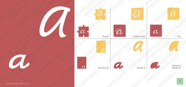
The primary image on this page is in the red box on the left on the handbook page as shown in the graphic below. This is also the images you see on the overlay keyboard button. You cut the lowercase by pushing this key. You get the uppercase by pushing this button with shift.
In the handbook, the first box to the left, in the top row, is the "Puzzle" feature box. To cut a lower case "a" puzzle piece, you need to push the "Puzzle" feature key and the "a" key. Add shift, and you get an uppercase "A" in your puzzle piece.
To the right of the puzzle square, is the "Instruction" square which can be cut by pressing the "Instruction" feature key or feature + shift keys. What
is the instruction feature you ask? This image is used to teach children the correct way to write letters. The arrows indicate how you form your letter from the point your pencil touches the paper. K-3rd grade teachers and parents might find this useful but others may not use it so much.
The last box on the top row is the tile box. You can use the letter tiles to create fun titles on scrapbooking pages or as building blocks to learn how to spell new words. Once again, to cut a lower case "a" tile piece, you need to push the "Tile"
feature key and the "a" key. Add shift, and you get an uppercase "A" in
your tile piece.
On the bottom row of the page starting on the left you have the "Notebook" box. This feature cuts out a sheet of notebook paper with the letter "a" in the right corner. This feature could be cut small to use in a page title or large - maybe for a page in a mini album.
The next two boxes are font shadow and font shadow blackout. They are used as layers to create dimension and are interchangeable with the primary letter "A". You can use all three together or a in a number of combinations with just two. For example, Shadow on Blackout make a bolder letter than the letter on shadow.
This last instruction page is an explanation about the foundation keys. The foundation keys are like shadows for the puzzle and notebook features. .
I hope this information was helpful for those of you who have wondered how to really use the other keys. I know there is a lot of redundant instruction but I wanted to be thorough.
On to the cartridge content of Cursive 101. Here is a look at the sample Provocraft puts on the back of the cartridge:
These are the letters, numbers and symbols in the Cursive 101 font in upper and lower case. Here is an important tidbit of information; Cursive 101 is one of just a handful of font cartridges that include the "+" sign
and the "=" sign.

There are a handful of images on this cartridge and they also have puzzle, notebook and tile options.
Click here to view to the Cursive 101 handbook in PDF format
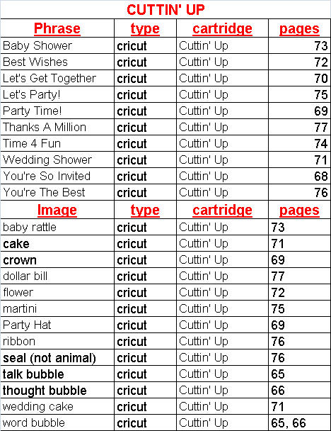
And finally; the list of all of the images and phrases on this cartridge with
their page numbers. Cursive 101 has a VERY short list but it may come in handy just the same. If you find any errors in the spreadsheet, please
let me
know so I can correct them. If you would like to share this information
on your blog, instead of copy and pasting this info, please paste a
link to my site. The spreadsheet below is saved as a JPEG but you can
download a PDF version of Cursive 101 here: