Showing posts with label Everyday pop up cards. Show all posts

Tuesday, October 23, 2012

Oh Everyday Pop-Up cards...why are you so hard to figure out?

Yesterday, I set off to do a really cool card and ran into one challenge after another (including losing an entire blog entry because blogspot was not able to save and then Modzilla decided to update without my permission.) rrrrrrrrr
so lets try this again...
Last week I promised to show you the finished card from this entry and provide more information about the Cricut cartridge, Everyday Pop-Up cards.  When I last left you I had cut out the card, the flower box for the front of the card and the pop up for the inside from page 48.  Instead of inking, I had used markers to trace the edges and was pleased with the effect.  The flower box does not have the "flowerbox" layer because I did not like the color contrast.  I chose a brown with too much red and it clashed with the other colors.

Above are the "pop up" cuts for this card.  As I mentioned in my last blog entry, I could not figure out how to incorporate the "friendship blooms" cut and it was not included in the instructions sheet addendum provided by Provocraft so I set it aside. (The link takes you to the pdf created by Joy at Everyday Cricut)

The cartridge only cuts one layer for each style within the pop up creative feature so the pop up is essentially one color unless you manually add your own.  I used my markers to color in my pop up. 

It took me a while to figure out how to fold the flower box so that the card could open and close properly. Once I did, I inserted the flowers into the flower box through the pre-cut slits only to find out that the flowers don't pop up unless you manipulate the stems inside of the box (see photo below).


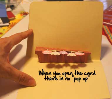
I manually adjusted it so you can see what would look like if it did "pop up" like it was supposed to. In order for the pop up to do as it should, I would need to make these adjustments manually every time it is opened.

Then there was the issue with the flower box that I planned to adhere on the front of the card.  Since the brown did not work out, I elected to discard the flower box altogether and created the scene below.  I embossed the brown paper with my Big Shot and used one of my Fiskars scallop punches to create the trim on the top. I did some inking, faux stitching and minor doodling with a white gel pen.
Not my favorite card but cute enough.  If only the pop up, popped up! 

For the next project, I cut mashed 2 cards together. 
 First, I cut the scalloped card and "Thank You" pop up (pop up creative feature +shift) from Page 22.
I cut the birds from page 51 with the intention of using them on the front of the card holding a banner.

I just couldn't see how the pop up could attach to the card so that it folded closed properly. 
I had to adapt the pop up portion of the card below because I could not figure out how to attach the pop up phrase.
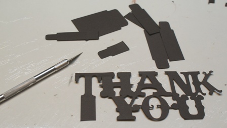
 I used my craft knife to removes the "legs" and adhered the phrase with pop dots.

To create the flags on the banner, I used the Birthday Bash cartridge.  There are a variety of flag shapes on pages 58-63 under the "font" creative feature.
I used a small circle punch to cut out the circles adhered to each scallop with a pop dot and the chipboard letters are by Fancy Pants.  I purposely rotated the direction of the stripes to give the card more interest.

I really like how this card turned out. Even though the pop up aspect is super complicating, I like this cartridge for its unique art work and its potential.  I will keep experimenting and once I get this cartridge figured out, I will share that information!

Sunday, September 30, 2012

Scrapbook News, Sept. 30, 2012

This is your weekend update for Sunday, September 30th, 2012... Here is our lead story.
The Isaacs' children got scrappy yesterday resulting in two mini albums and several requests to scrapbook everyday.


Both children reportedly mastered using the trimmer and the glue stick.  Their ability to work independently in this fashion was undocumented until now.


When asked what was their favorite scrapbooking product, Aidan said he really enjoyed working with Hambly borders while Eva felt that K and Company stickers fit her style perfectly.


Both children agreed that the best thing about scrapbooking was doing it with their mommy.

In other news, Everyday Pop-Up Cards arrived from last weeks ebay auction.  It was immediately unwrapped and put to the test.

Everyday Pop Up Cards first impressions:

 
I couldn't wait to start playing with this cartridge and selected the flower box on page 48 to use as my test subject.  I used my Imagine so instead selecting paper from my stash I assigned the RBG codes for the Imagine to print.  This made me think of an idea for Provocraft to consider.  Wouldn't it be great if the included the RBG codes for the various elements in their handbook samples?  I suggest this because there is always a learning curve with a new cartridge. Eliminating the color selection step might be helpful so perfectionists can learn the in's and out's of the cartridge without getting hung up on the color palette decision.
Once the layers were printed and cut, I revisited the question that often haunts me: to ink or not to ink?  I decided to use my markers to outline the images.  In order to do this without getting ink on my work surface, I traced the cut lines before I pulled anything off the mat.  This worked really well-  especially since my Imagine was not calibrated correctly so there were white edges in some places.
Here is an example of the flower box minus the brown box layer.  You can see that the markers gave the flowers a playful boost.

Next, I tried to put together the pop up portion of the card but found it difficult to figure out what went where and how.  I was shocked that there were no instructions in the handbook!  I did a little web search and found an assembly instruction PDF  on Everyday Cricut.  Thank goodness for that blog because they also had a bunch of photos of finished cards that gave me a sense of how a card should look when completed!  The diagrams were created by Provocraft and originally posted on their blog. I printed out the instructions (you are supposed to view the diagrams at 200%, but I printed them out small to save paper and used my magnifying glass, lol.) and I was really disappointed with the assembly images.  Boooooo!  

I tinkered with the pop up part of this card for hours and ran into one problem after another.  Here is a list of the primary issues uncovered for this projecct. 
  • The card and pop-up did not cut proportionately to the flower box that was supposed to go on the front of the car.  The pop up was way too small even though real size was NOT selected.
  • As you can see in the photo above, the pop up does not offer multiple layers, so the pop up inside of the card will be a solid color unless you add color by hand.
  • Also in the image above, there are 2 pop up options.  The flowers on the bottom and the "Friendships Bloom" above the flowers.  In the diagrammed instructions, the "Friendships Bloom" pop up is not even shown, so I had no idea what to do with it.
  • Even though I used card stock, the stalks on the flowers were so thin that they wanted to bend or tear whenever they were handled.  Once placed inside of the card and closed, they were never to "pop-up" again.
  • I had no idea where to attach the pop on the interior walls of the card.
  • There were no score lines (dashes) on the pop up flower box.  Just 2 slits on either side which I used to create a score line.  There were only two sets of these slits; the remaining 3 folds had to be eyeballed from the diagram.
The finished card along with a complete cartridge overview will be posted later this week so stay tuned.

Our closing story for the night is a look at recent acquisitions by Jilliene Designs. Awarded with a $90 credit for Scrapbook Island from their annual Flea, several purchases were made over the last week.


The cricut cartridges were obtained at auction (ebay) and performed the special task of relieving stress as covered earlier this week in this round table discussion.
 

The blending tool was reported to be a "must have" inking accessory in this recent poll.


The remaining items were so stinkin cool that they enticed to join the Jilliene Designs team.  Follow up articles will surely show their performance. 

That is all for now...we'll see you next week.  (queue music and closing credits... and out)