Thursday, May 30, 2013

Modifying Cricut Cuts to Match Your Project, Part 2


This is my 2nd installation in a 3 part series about modifying Cricut image die cuts (the 1st entry can be found here.)

This project began when I decided to purchase the Cricut Cartridge "Pack Your Bags" so I could use the "family" layered image on page 33.
  
It wasn't until after I had opened the package and looked through the handbook, that I realized there was a big sister and little brother in the image.  We, the Isaacs family, have a big brother and a little sister so that was not going to work.  Being the crafty little busy body that I am, I decided that I had to find a way to alter the die cut to match our family unit. I have used my process of changing the original design as a test case for sharing the various tricks you can use to alter any Cricut die cut- post cut.
 
My last post was all about my first stages of experimentation.  
 

Having shared what worked and what did not work in that post, this next installment shows the steps to a successful transformation. I elected to leave out all of the failed attempts that took place in between the successful ones- but rest assured, there were plenty.  My hope is that the following tutorial will help you avoid those errors in any of your future Cricut image alterations.
 
DAYS THREE & FOUR:
There was no point in mutilating my first altered family image any further so I started the project fresh.  I sat down and wrote out what parts were going to be changed to accomplish the switch from big to little sister, from little to big brother, the change of hair color for mom and kids and the change of clothing for everyone.  I highly recommend doing this whenever you are going to do an alteration that will entail more than a couple of steps.  By processing my thoughts this way, I was able to organize the changes I wanted to make and record the specifics like size, color and the page numbers for a layer substitutes (like the baseball cap for the mom from my 1st post).  Once I had all of this information organized, I entered my cuts and specifics into my Cricut Imagine and made the cuts. When I was unsure of a size for a replacement layer, I cut 3 different sizes to try out. I made every effort to use ONLY the "Pack Your Bags" cartridge for all of the layers.  The only layer that came from another cartridge is mom's baseball cap.  A detail that could not be overlooked.

The following is a list of cuts you would need to make if you were going to change the image configuration, plus replace hair with 2 different shades of hair color and revamp some of the clothing selections for each character. The list of cuts plus the RGB #'s (for Imagine owners) are as follows:
Base at 6.0 Relative Cut
2 Black (0,0,0)
1 Honey Brown (192,165,109)
1 Sandy Brown (146,113,66)

Base +shift 6.0 Relative Cut
2 skin (255,220,178)
1 skin -FLIPPED/MIRROR (255,220,178)
1 red (255,0,0)

Layer 1 6.0 Relative Cut
1 gray (128,128,128) (mom's shirt only- discard other pieces)
1 white (255,255,255) (mom's smile interior -discard other pieces)

Layer 1 +shift, Relative Cut -sizes vary
1 red (255,0,0) size 6.8
1 blue (0,0,255) size 6.

Layer 2 +shift, 6.0 Relative Cut
1 bright pink (255,26,136) (mom's shorts and both female mouths)

Page 32, Base True Cut
1 lime green (50,205,50) size 1.4 (dad's shorts)
1 lime (0,255,0) size 1.3 -trimmed 1/8" at bottom (boy's shorts)


Page 39, Base +shift
1 light blue (176,224,230) size 4.8 -top portion removed (girl's dress)

Once you have your various layers cut, you will adhere the skin to the black base. Yes, they will be naked.

Set the two nude families aside.  Next, grab the "base +shift" FLIPPED/MIRROR'ed in skin color and cut off the mom's arm.  Don't worry, she won't feel a thing.  Now discard the body and put the arm somewhere you won't lose it. An unattached arm can easily find its way into the trash.

While you are chopping off body parts, you might as well scalp the 2 kids and mom from the 2 shades of brown "base+shift" layer cuts. You will need those scalps to change the hair color of those characters.  Make sure you discard their bodies also. The less loose paper in front of you the better.

Next we are going to transform Dad's shirt from missing a chunk (purposely done by Cricut to indicate the location of the girl's head and hair) to a complete shirt so the empty space won't be visible in the new image configuration.
First you'll chop off dear old dad's head.  Then you will lay the "layer 1 +shift" shirt over the top of the headless body and make a light mark to show where the shirt would extend to if it wasn't trimmed.  Cut out the shirt including the section you lightly outlined. Make sure you cut the shirt a little smaller than the actual shirt extends so it won't be visible when you stack the two shirts.
Now tape the newly cut shirt to the back of the "layer1 +shift" shirt which will give you the shape of the shirt if it were whole. Next, place your taped piece, face down, on top of the back of a piece of paper in the same color. You might want to adhere it down with a piece of tape that is not very sticky so the shirt does not move while you trace it.

(tip -I put a fresh strip of tape on my clothing, then remove, over and over until the lint from the fabric blocks most of the sticky so it will be easily removed from a project without damaging the paper or image).
Trace around the mock shirt, then remove the tape and finish the outline.  Now cut out dad's new shirt.

Now we will start working on our naked families again.  The first thing we want to do is designate which set will be used for the kids and which will be the base/ parents.  For this tutorial lets call the image (below) on the left "kids" and the image on the right "parents."

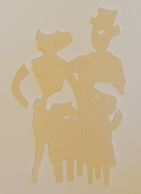
Let's trim off all the kid "fat" from the parents.  This means removing the dress edge on the left and in between dad's legs to give him a physical form.  It does not have to be perfect because he will have clothes that will hide the trimmed edges.  We will also remove most of the little girl's head and hair plus the lower portion of dad's arm giving dad a torso.
You also need to remove a portion of the little boy's head and body near mom. Trim his head around mom's left hip and remove the bottom of his body.  This cut will also take away the slight illusion of mom's left leg (which was almost directly behind the boy's). We will fix this at the end. Put all of your scraps in the trash so only the parts we have purposely cut out remain in front of you.

Now let's move over to the "kid" family.  We are going to emancipate these kid's very carefully.  Use the slots Cricut cuts as layering guides to slice the children away from the parents bodies.  You will be cutting through the skin and the black base so you may need to go over your cuts several times.  Once you are done, make sure to remove any hangnails that are still hanging off from the trim.

Below is what our two families will look like when you have finished working on them. Do not dispose of the the "kid's" family yet as you will need mom's leg a little later.

Now adhere mom and the kid's new hair.  Mom's hair will be awkward and wonky so you will need to cut her baseball cap out immediately.

Put in the "Nate's ABC's" Cricut Cartridge and select the baseball cap icon (page 65).  Cut her hat at .09" in the color you want.  Once it is cut... for the love of Pete, glue mom's hat on! A bald head is no way to leave your mother!

The first step in making the boy bigger and the girl smaller is to cut both children's legs off.  In the same position you cut them in, put the legs aside.

It is now time to dress our family. I am going to bullet these next actions so you can identify specific steps without having to skim the entire paragraph.

  • Adhere mom's top and shorts
  • Adhere dad's full red shirt and new long green shorts. You will have to tinker a little to comfortably align the shirt with the shorts and the shorts with the legs. The remnants of the little girl's face and the trimmed edges from cutting away her skirt are now hidden by dad's new outfit.
  • Find the arm we cut from mom on the "base +shift" FLIPPED/ MIRROR'ed die cut. Glue the top part of the arm under the left sleeve on dad's shirt so that it naturally curves into his body.
  • Place the boys shirt on his body for positioning. When you put the boy's shirt on you will notice that it is a little larger than it should be.  We cut a larger size because we want the extra length to make him taller.  You will need to tinker with the neckline to make it work before you glue it on. Do not put adhesive on the very bottom of the shirt because we will be tucking the top of the shorts underneath.
  • Trim about 1/8" off from the bottom of the boys shorts so that once you have assembled the body, the bottoms won't look like clam diggers or high waters.  
  • Put adhesive on the top portion of the front of the shorts and tuck the top of the shorts under the shirt. Reinforce with tape.
  • Place the boy strategically on top of mom so that his body covers up any of the visible leftovers from our modifications.  You will want to have his head land just under mom's left shoulder. 
  • Adhere the top of his body in this spot with a tiny amount of adhesive so you will be able to remove it in a few moments. 
  • Place glue on the front top of the boys amputated legs and slide them under the shorts so that his feet land in the same space as dad's and mom's.  You will also want to tinker with the position of the legs so that the feet look natural in their pose.
  • Now carefully remove the boy and tape the legs on to the back of his body.  
  • Apply several thin foam adhesive squares to the back of the boy so he is attached to mom's body securely while creating dimension.
  • Position the light blue halter dress horizontally on your mat and cut vertically just above the bodice slits.
  • Align the dress to her shoulders and adhere the dress to the little girl.
  • Adhere the tiny white interior of the mouth to the larger pink smile so that the combination looks like white teeth in between pink lips.
  • Adhere both mom and girl's smiles in the spaces indicated by Cricut's guide lines.
  • Attach the little girl on top of the dad with foam squares
  • Attach the leg we saved from the kid's family under the boy's leg so that the mother appears to be standing on two legs.
Because my final layered image was supposed to look like our family when we went to Disneyland, I pulled out my Mickey and Friends Cricut Cartridge and cut 2 tiny Mickey's for mom and dad's t-shirts.  One was cut at .07" and the other was cut at 1".  I love how the whole thing came together!!!


And that is it for this portion of the tutorial.  I took Days 5 & 6 off and then spent a couple of days preparing and typing up this post which brings us to the present day.  I hope this tutorial will help you to avoid investing large chunks of time to make changes to your die cuts.  It can be a time consuming process if you do not have a strategy.

In the last installment of this series, we will look at various ways you can disguise blemishes, rough edges and other deficiencies in your Cricut image adaptions. I will also include some great examples of other Cricut die cut modifications.  There is still so much more to share about this valuable skill.

Monday, May 27, 2013

Cricut Tutorial: Modifying Cuts to Match Your Project.

I coveted the Cricut "Pack Your Bags" cartridge for over a year.  I just loved the artwork but I didn't have photos that warranted the purchase.  Then, we started planning our trip to Disneyland and I finally had my reason: page 33!
It wasn't until after I had opened the package and I looked through the handbook carefully, that I realized there was a big sister and little brother in the image.  We, the Isaacs family, have a big brother and a little sister so that was not going to work.  Well that was just a big fat bummer.  Being the crafty little busy body that I am, I decided that I had to find a way to alter the die cut to match our family unit. Welcome to my journey...lol.
This post is about the different tricks I used to change "the family" die cut in the Cricut Cartridge, Pack Your Bags, but, more importantly, it is a tutorial about altering any die cut to suit your needs- post cut. Certainly you can alter many Cricut images by using Cricut Craft Room, Cricut Design Studio or by using a Cricut Gypsy.  However, there are always instances when you will need to pull out your craft knife to remove an "s" on a phrase, or change a haircut on a figure.   In this tutorial I will be making changes in a variety of ways - some will be more successful than others.  Hopefully my experimentation will give you a jumping off point for those custom changes you will make in the future.
Day One:
Originally, I had planned to make this change, take and edit my pictures, write my post and publish to my blog before the kids got home from school.  In all honestly, it had been a while since I had used my Cricut and so my cricutty intuition and creativity were a little rusty.  Just putting together the images as intended by Provocraft felt a little challenging.  I neglected to consider all the elements in each layer so when I cut layer 2+ shift in black I was oblivious that both the daughter and mother's lips would also end up being black.  You see what I mean?  When you use your Cricut, you have to look at your projects with a broader view than what is in front of you.

So this first run at altering the family die cut is not the most efficient way of approaching this challenge.  None-the-less, I felt it was valuable information about altering images so it will be my first installment in this series.


Above, are all the layers you need to cut to create the die cut image of "the family" as laid out in the Pack Your Bags handbook, plus, 2 extra cuts (totaling 3) for Layer 1 (1 in white, 1 in red and 1 in grey) and 1 extra for Layer 2 +shift (white and black).  The reason I cut multiple copies is because those layers include bits and pieces of clothing for several of the characters in the completely assembled die cut. I cut Layer 1 in 3 different colors to make the clothing match our outfits from a photo taken at Disney. Layer 1 contains the mom's shirt and hat, both the dad and the son's shorts and the daughter's purse.

Note: I have a Cricut Imagine so instead of cutting with various colored paper, I printed the clothing colors (RGB codes) to match our clothes. Now if you weren't trying to match a specific look, multiple copies in different colors would not be necessary.

Once the layers were assembled, this is what the die cut looked like.  I used a small amount of re-positional adhesive to hold the pieces in place.
You will see my ugly cutting mat as the backdrop in this photos because that is how I like to stack the layers.  The cutting mat holds the base in place making assembly more stable.  Plus I can place the pieces I am going to use on the mat so I don't have to worry about loosing them and put the extras aside.  I cannot tell you how many times I have lost pieces from a layer cut.  It makes me crazy!

My kids and I have lighter hair so I re-cut the base layer in 2 different shades of light brown to replace the black hair you see in the cut above.  The black hair comes from the base cut which, in addition to the hair, provides a slight shadow for the entire image, everyone's eyes, dad's brows, dad and boy's mouths, mom's sunglasses and everyone's shoes.  Because the black provides so many details, we only use the hair portions from the 2 new base cuts and discard the rest of the image.
I also cut another layer 1 in a darker shade of grey and another layer 2+ shift because, you guessed it, I lost the mom's lips.  From the two base images I carefully cut out the hair for mom and the 2 kids using my craft knife.  There are small slits cut into the base to show you how to stack the different layers which I used as my cutting guides. Unfortunately, there were no slits to indicate that mom had additional hair visible under her hat therefore mom was missing the hair under her hat and above her glasses.  No worries, this would be easily fixed. But what I learned was that you cannot depend on the slits as a definitive source for dissecting images.  I also decided to keep notes about images that I wanted to change.  I needed to call out where the Base image was visible, where the Base +shift, Layer 1 and 2 and Layer 1 and 2+ shift pieces belonged on the final image. Observing and notating these factors would simplify the alteration process.

Are you still with me?

The next task was to fix mom's hair and turn her sun hat into a baseball cap.  I tried editing one of the extra hats I had cut out (see below), but it wouldn't work- the shape was not right. I was going to have to find a baseball hat on another cartridge. After searching my Master Table of Contents, (I have all of the cheat sheets, just like I post here on my blog, put together in excel and I use the "Find" feature under the Edit drop down menu to locate specific images) I found several options but Nate's ABCs had a hat that was facing the right direction and seemed to have a brim that would mesh well with the overall design.

I put in the Cricut Cartridge "Nate's ABC's" and selected the baseball cap on page 65.  I wasn't sure what size to print and cut so I used the Cricut cutting mat as a guide - I guessed somewhere between .05 and an inch, but to avoid having to cut over and over, I cut 4 different sizes: .05", .07", .09" and 1.1".
The boy and girl have black hair in the several pictures because the cut-outs kept getting lost so I set them aside for safe keeping.  I hope seeing them with black hair doesn't confuse you.
The 1.1" worked great.  I located the missing piece of mom's forehead hair and put that and the hat on mom's head.  It looked pretty good.

NOTE: You may have noticed that 2 of the hats have a white strip on the top.  This happens when the printer function and the cutting function on the Imagine are not aligned.  It is relatively simple to fix but it is time consuming so the white strips will show up again on this tutorial and I'll use ink to disguise them on the finished die cut. 


HINT: Imagine owners, I turned the cutting speed to 3 because I wanted to cut a ruffle for the blue dress. I forgot to change it back and as a result, the printing and cuts matched without having to stop to align! Perhaps slower speeds make the machine more accurate.

Now it was time to make the big girl a little girl and vice versa.  I placed the dress on the boy and I moved the boy clothing over to the girl form.  I needed to make larger shorts for the girl figure so I picked out a child, "Charles", on the Cricut cartridge Playtime and cut the shorts as 2.5", 2.7", 2.9" and 3.1" just like I did with the hat.
These shorts were too short and wide to work with the shape of the girl so I tried another kiddo from Playtime; "Trevor".  This fit was better but I would still have to do some trimming with my craft knife.

Now came the hair for both the girl and boy.  I tackled this issue by flipping or mirroring the base image so that the mom and son (now daughter) were on the left and dad and daughter (now son) were on the right. Then I cut the (flipped/ mirrored) base image again in the light brown shade.  Now I had to wing it to create hair-doos that would blend into the overall image and look reasonably gender appropriate.  I also had to do some trimming on the left side (skirt), in between and on the left side of the girl's (now boy's) legs.  I also needed to add a little extra skin color on dad's left elbow which had been previously covered by the girl's hair.  

Now for the girl (previously a boy): the girl's dress was too thin in the center as it was cut to give the illusion of arms on a larger body.  I tackled this problem by converting the dress to match my daughter's Cinderella dress that she wore our first day at Disneyland. I used some elements from the dress on page 25 from Cricut Cartridge Formal Occasion to hide the dress issues.  I chose the dress overskirt panels because my daughters had the same element.  

Even after adjusting the children's bodies I saw that I had a lot of other problems: the the big brother (once big sister) was missing a mouth which was supposed to be pink lips from Layer 2+ shift.  The little girl (once little boy) had no feminine features whatsoever, so I tried to add blue eyes to her face to make her a little more "pretty"... which ended up looking "creepy".  I covered the missing flesh color on dad's arm but now it looked wonky and the little girl's hair was a bit of a train wreck.
Are those overskirt panels on her dress or has she put her fairy wings on backwards?

I had been at it for 4 1/2 hours (believe it or not) and the kids were now home.  I needed to get started on their homework so I put the project aside thinking I would return later that evening with a fresh pair of eyes, make a few tweaks, and have the entire post up by midnight.  But by the time I had the kids in bed and said hello to my husband I had no interest in looking at the project again.

Day Two:
The next day, I edited my photos and started typing this entry thinking that I would go back to the project and write my ending a little later.  While writing down the steps I had taken to modify the die cut the day prior, I had an epiphany;  I thought of a new way of approaching the problem entirely, and that is when I decided to make this a 2 part series.  By doing a 2 part series I would be able to share what I had learned through my mistakes and retry my alterations on a brand new base with new clothes etc, etc.  It also meant that I wouldn't have to return to that odd family I had created the day before. Thank goodness (sigh).

Believe it or not it took a large part of day two to write this entry, then go through the photos taken as the project developed and then crop, adjust lighting and decide which ones to post in conjunction with my text.  It looked like my next pass at modifying the family image was going to happen on Day 3.  In addition, I couldn't post this entry until I proofed it for grammar and errors so it would not go up as planned. Hmmmmm. This was taking longer than expected.  

Have you found yourself in this same boat when you work on new projects with new techniques?  It is fascinating how long something that seems so simple can end up taking. But this is how we master skills and develop new ideas.  Learning something new cannot always be taught with a step by step tutorial.  We have to experience the learning to really understand something. I hope this learning experience is helpful to you in some way.

Saturday, May 25, 2013

Cricut Tutorial Coming Soon...

I have been a little quiet this week, especially after a week of daily posts.  The reason is that I am working on a three part series on modifying Cricut images to coordinate with your needs - post cut.  In other words, I will share ideas about making changes after you cut the layers of a specific image.  I will show you how I manipulated the look of an image by trimming portions, adding layers from other images, and re-constructing the image into a different configuration.

Some of these changes could be done in Cricut Craft Room, Cricut Design Studio or with Cricut Gypsy.  This tutorial is for those Cricut lovers who are not technically inclined.  It also offers examples for working with images that can only be altered by hand and hopefully, there will even be a few tips for those die hard crafters who live for the challenge of customizing their projects.

I should have the first entry up tomorrow.  It has taken a little longer than I expected to properly construct the tutorials. Partly because I selected an image I had never worked with so it was a trial-by-error process. I made many mistakes but learned a lot. 

Have a great night!

Sunday, May 19, 2013

Cupcake Flower Lights Reconfigured

 
If you spend any time on Pinterest, you have probably seen this pin:
This darling project was created by Steph Hung at Oh Happy Day.  This blog is amazing; packed full of fabulous DIY, party, home decor and craft ideas.  In her post, Steph said that her inspiration for this project came from the "beautiful blooms" she has seen around town (San Francisco, CA). Well from the moment I saw this pin, I knew I had to give it a try.

I took my 25%-off-your-entire-purchase coupon to Michael's and bought 4 packages of the mini-cupcake wrappers ($1.99 reg price - 25% = $1.50 each) and 4 packages of standard sized cupcake wrappers from the $1.50 bins next to the checkout (on sale for $1.00 each - 25% off = $.75 each).  So now I had the supplies; I just needed to find the time to cut 100 flowers out of cupcake wrappers.  Oh how I wished we had a shorter strand of Christmas lights.

It just so happened that my son, Aidan, had to finish his Mission for his 4th grade CA mission report (a requirement for all 4th graders in California).  Instead of doing a model from craft store supplies, he decided to make his from Legos.  At first the construction was exciting for him, but because it was such a huge project, it had become a daunting task and with it being a beautiful Spring day, it was a challenge for him to stay focused.

I offered to work on the cupcake flower lights along side him while he worked on his Mission.  He liked that idea a lot and dumped his extensive collection of Legos all over my bedroom floor while I started cutting flowers and leaves.  Once I began assembling the flowers onto the strands, I noticed that my damn lights were twisted every which way!  I couldn't manage to keep two consecutive lights in a row facing the same direction.  Every other flower was at risk of getting smashed. I realized that when I went to hang the lights I was going to have a heck of a time making many of the flowers visible.  Unacceptable!

So in typical Jilliene fashion, I came up with an extravagant solution that was disproportionate to the problem.

"Lets make flowers facing both directions! This way no matter which way the strand twists, a flower is visible. And lets make the flowers more intricate so that even if you get a side view, you will be able to see the pops of color!"

I removed all of the flowers I had already assembled and started all over again.  It didn't occur to me until I was an hour into the new design, that this was going to mean 200 flowers - 200 more elaborate flowers.  Oh well, I could see from the flowers I had already made, that this was going to be amazing!

It is important to point out that I am adapting a project here, not creating a new one. This alteration does not make the double-sided-more- elaborate-cupcake-wrapper-flower-lights project MY design.  I am not the author of this craft.  This is Steph Hung's creation at Oh Happy Day.  The lights I am showing you here on my blog are my interpretation of her original project.  I mention this because far too often artists and crafters tweak something they saw elsewhere and then call it their own.  That is plagiarism fair and simple.

The tutorial (and pin) I posted at the top of this article is really all there is to making this project, but I am going to share a few of the things I added, learned and/ or adapted for my project.
  • You might want to start with a short strand of lights.  25 seems like a reasonable number..
  • Buy extra green small wrappers for the leaves.  I ran out.  Twice.
  • Before you get started, pick the pattern you want to use for your strand.  You could go free-style but if you want to avoid having two or three red flowers in a row or groupings of big flowers (big flowers need extra space around their light bulb- side by side- they get crinkled or torn.) you should have some kind of a plan or you'll probably have to back track at some point.  I did a pattern of 3 small flowers, 1 big flower, 3 small flowers, 1 big flower, etc. and I tried to alternate colors and styles.
  • Cut the X in the center before you cut your flower and leaf shapes. It is just easier.
  • Cut multiple leaves and flowers at one time and stock pile them until you have assortments of colors and styles to choose from. When I first started, I cut out one flower and attached it to the strand and then cut out another flower and attached it to the strand. This quickly became tedious.  Once I made an assembly line, I had more fun creating the individual designs plus it seemed to go a lot quicker.
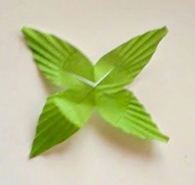
  • Let's talk about the flowers with a "central bell or corona." The example below consists of a green cupcake wrapper cut into leaves, a big yellow cupcake wrapper cut into a flower shape and a small blue cupcake wrapper in its regular form, only turned inside out.  The blue wrapper in the example below is the central bell or corona.  This is an adorable feature to use in your strand but it isn't as easy to put together as it seems. First of all, turning a cupcake wrapper inside out distorts the shape and the center never returns to a perfect circle.  Second, if you opt to make this project with double sided flowers, when you design your bottom flower, you will need to cut slits on the edges of the corona so the cord can run through the middle of it.  Third, be very careful of these types of flowers when you set the strand down on a surface so they don't get smashed.  All that said, they are totally worth the extra care!
  • If you go with double sided flowers you will assemble your flowers on the light bulb in this order:
    This is the look you get with a double sided flower. Definitely not a necessity- the lights are adorable as Steph made them. Its just another twist.
  • If you are going to make a leaf/ small flower combo, try cutting the small cupcake wrapper down to a smaller flower so you can see the leaves pop out behind the petals. 
  • After you have finished your strand and you are happy with the final look (i.e.- you are not going to move any of the flowers around), take a little piece of tape and put it around the wire above the top of the flower but below the bulb. This is to prevent the flowers from slipping of the light.
    Those of you who read my blog regularly know that I am not a clean, pristine, flawless artist.  A long time ago I tried to walk that road and I was lost before I knew it.  I so wanted to be impeccable and detail oriented but it just isn't who I am.  I have accepted that my best work comes when I let go of "the" expectation and the most fulfilling work comes when I disregard any kind of audience.  

    I mention this because in comparison to the original design, these flowers up close are sort of a hot mess.  They are willy-nilly and lots of silly but collectively, I think the strand is beautiful. The bottom line is that cupcake liner flower lights are awesome and regardless of your style, there is a strand waiting for you!


Friday, May 17, 2013

Creating Mosaic Garden Stones


I fell in love with this Mosaic At Disney's California Adventure.  It is truly a masterpiece with its vibrant colors and unique design.  It also offers amazing tactile opportunities with unexpected protruding elements and a variety of textures.

Ever since I saw it I have been obsessing about doing mosaic stones for our garden.  I bought some colored ceramic plates and glass stones from the dollar store and my husband picked up some concrete at Home Depot for $5.  To break the plates, I put each plate inside a ziplock, then inside a small trash bag and then in a large trash bag.  Before taking my hammer to each plate, I put on safety goggles to protect my eyes from stray shards and gardening gloves to protect my hands from microscopic cuts that occur when handling broken ceramic pieces.

I need order to create freely.  If things are in disarray I become distracted and frazzled so I was compelled to separate all the different colors and types of mosaic tiles into tupperware and then I placed them in the kids wagon so I could move them around when I wanted to work elsewhere.  I called it my "Wagon of Wonderful."
Just looking at this "Wagon of Wonderful" made me happy.

Next I traced the perimeter of the tub I was going to put my cement in and sprayed it with adhesive.  This gave me a measurements guide to create a design on.   I applied the adhesive because it prevented the tiles from moving if I bumped the table or the paper accidentally shifted.

Once I finished, I would mix and pour the concrete into the tub and then I would have to quickly transfer the design onto the concrete before it dried. 
Because I was working in the sun, (it didn't occur to me that this might speed up the drying process - duh!) the concrete started hardening faster than I could transfer the tiles, so I used a spray bottle to moisten the cement, which was very effective.


 This is my first garden tile (above) and below is my second one.


The concrete will dry overnight and then tomorrow I will use white grout to fill in the cracks between the tiles.  The smudged concrete on the glass stones and ceramic pieces will wipe off easily so they are colorful and shiny once more.  The white grout should contrast the color palette nicely making the garden tiles look nicely finished.

I will share photos of all of our tiles when they are completed.  We intend to do a few more over the weekend with the kids.  I have decided not to let the kids use the crushed plate pieces as they are sharp and leave your hands feeling raw after you have handled them.

Have a wonderful weekend!