Showing posts with label list of words/ phrases on a cricut cartridge. Show all posts

Tuesday, July 17, 2012

Reading Cricut Cartridge Handbooks & Cursive 101


I thought before I wrote about the Cricut font cartridge Cursive 101, I would spend a few minutes talking about the handbooks and overlays that come with each cartridge.  Even though the handbooks include instructions in the front (often in many different languages), I have often been puzzled about what I actually have to work with.  So I thought we would review the instructions provided by Provocraft and fill in any blanks that might become evident.  
Below is an introduction to the overlay and how you can use the shift key to switch from the bottom image or lowercase letter to the top image or the uppercase letter. This process is the same as we use on our computer keyboards including the option to use shift for one selection or shift lock for multiple selections.
 This next page talks about Real Size.  I'll be honest, I have avoided using this feature because A) I don't need it; and B) I'm afraid if I toggle it, I'll never get back to the uniform sized setting where lower case letters are smaller than uppercase letters.
The page below is important because it shows you how to multiply your cartridge potential from the visible choices on the overlay keyboard by 12. I didn't quite understand how to work with the feature keys when I first started cutting with my Cricut so I am going to spend a little bit of time elaborating on this section.  Before I get started, take a second to look at the instructions included in the handbook below.
To expand on their description of the feature keys I want you to look at the handbook page for "A" in the font, Cursive 101, below.

 The primary image on this page is in the red box on the left on the handbook page as shown in the graphic below.  This is also the images you see on the overlay keyboard button. You cut the lowercase by pushing this key.  You get the uppercase by pushing this button with shift.
In the handbook, the first box to the left, in the top row, is the "Puzzle" feature box. To cut a lower case "a" puzzle piece, you need to push the "Puzzle" feature key and the "a" key.  Add shift, and you get an uppercase "A" in your puzzle piece.
To the right of the puzzle square, is the "Instruction" square which can be cut by pressing the "Instruction" feature key or feature + shift keys.  What is the instruction feature you ask?  This image is used to teach children the correct way to write letters.  The arrows indicate how you form your letter from the point your pencil touches the paper. K-3rd grade teachers and parents might find this useful but others may not use it so much.


 The last box on the top row is the tile box.  You can use the letter tiles to create fun titles on scrapbooking pages or as building blocks to learn how to spell new words. Once again, to cut a lower case "a" tile piece, you need to push the "Tile" feature key and the "a" key.  Add shift, and you get an uppercase "A" in your tile piece.

On the bottom row of the page starting on the left you have the "Notebook" box.  This feature cuts out a sheet of notebook paper with the letter "a" in the right corner.  This feature could be cut small to use in a page title or large - maybe for a page in a mini album.

 The next two boxes are font shadow and font shadow blackout. They are used as layers to create dimension and are interchangeable with the primary letter "A".  You can use all three together or a in a number of combinations with just two. For example, Shadow on Blackout make a bolder letter than the letter on shadow.

This last instruction page is an explanation about the foundation keys. The foundation keys are like shadows for the puzzle and notebook features. .
I hope this information was helpful for those of you who have wondered how to really use the other keys.  I know there is a lot of redundant instruction but I wanted to be thorough.

On to the cartridge content of Cursive 101.  Here is a look at the sample Provocraft puts on the back of the cartridge:
These are the letters, numbers and symbols in the Cursive 101 font in upper and lower case. Here is an important tidbit of information; Cursive 101 is one of just a handful of font cartridges that include the "+" sign and the "=" sign.

  There are a handful of images on this cartridge and they also have puzzle, notebook and tile options. 
 Click here to view to the Cursive 101 handbook in PDF format

And finally; the list of all of the images and phrases on this cartridge with their page numbers.  Cursive 101 has a VERY short list but it may come in handy just the same. If you find any errors in the spreadsheet, please let me know so I can correct them. If you would like to share this information on your blog, instead of copy and pasting this info, please paste a link to my site. The spreadsheet below is saved as a JPEG but you can download a PDF version of Cursive 101 here:


Saturday, July 14, 2012

Cricut Cartridge Car Decals Overview

I'm sorry I haven't posted in a couple of days.  My husband came down with pneumonia and so I was busy keeping him comfortable. I meant to post yesterday buy since I haven't used the Car Decals cartridge much, I wanted to take it for a spin before I sat down to write.

So today we are looking at the Cricut Cartridge Car Decals PLUS I would like to spend a little time talking about Cricut tips, tricks and lessons learned. 

Yesterday, I was tinkering with Car Decals so I could offer some hands on feedback about the cuts and features. In the process, I ran into a couple of hiccups which can happen when you are working with a new image. It occurred to me that I should really write down the problems I run into and keep track of the lessons I learn along the way both, so I don't make then again, and so I can share them with you. 

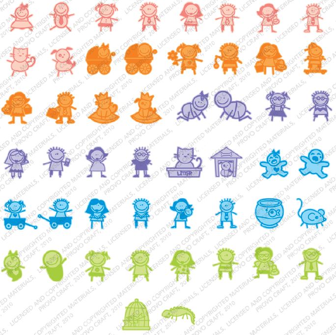
Above is the sample sheet that is on the back of the cartridge box.  Aren't these images super cute?  I love the whimsy and playfulness of these little characters.  Along with these cuties you also get a font, phrases and many additional images.  
The cartridge includes 0 - 9, A - Z and the all of the punctuation elements that come with a font. There are capitol letters only, no lower case.

Let's spend a minute talking about the primary or main  images on the Car Decals cartridge. Below is a page out of the handbook.  To the left, in color, is the primary image for the key on the key pad.  Below the image is a mini key pad image that shows you the location of the key on the overlay.  I *LOVE* this feature and wish it was in all of the handbooks.  With the main image it isn't too difficult to locate the button on the keypad overlay, but when you apply shift, or go into a layer or other feature keys, it can be hard to "see" which key to push for additional layers, phrases or fonts that are also a product of that key.  It makes it so much easier to have a quick reference on the handbook page. 

To get the primary image you cut the baby girl outline (at the bottom on the left), then press shift and cut the shadow that goes underneath (next to the outline on the right).  The primary image is an outline so once cricut cuts it, you will be left with both the outline and the internal pieces. USE YOUR SPATULA WHEN YOU REMOVE THIS LAYER.  Save the eyes and smile so you can adhere them in the face  Unless you are cutting the image pretty large, the eyes may not be perfect circles as shown in the sample, so I use a 1/16 inch hole punch to get the tiny dots.

The outline portion of the primary image is more difficult to cut when the image size gets smaller, but it is not impossible. I had to tinker with my pressure, blade and speed setting so that the fine details like the little curl below the bow, didn't tear.  After a couple tries with regular scrapbook paper I switched to cardstock to see if I could get a cleaner result and it was much smoother. I'm sure if I had played with the settings a little more, I could have gotten the cut with the scrapbook paper but I liked the cardstock color better. I set the blade at 5, the speed at 4 and the pressure at 5.

Below is the same page but with more details about each of the key features.
 This is another page in the handbook with similar information.

Next we a list of all of the images and phrases on this cartridge with their page numbers.  If you find any errors in the spreadsheet, please let me know so I can correct them. If you would like to share this information on your blog, instead of copy and pasting this info, please paste a link to my site. The spreadsheet below is saved as a JPEG but you can download a PDF version of Car Decals here:


A few issues and observations with this cartridge:  
  • When working with any image, with this cartridge or another, I keep a little notebook and pen next to my cricut. When I cut an image I try to jot down the size of the cut so that if I go onto something else and then later, realize I want to add a shadow, I know what size the original cut was.  You can spend a lot of time trying to figure out what you did when you want to recreate something and unless you are using Design Studio, Gypsy or Cricut Craft Room, the machine memories of project are gone when you move on to another cut.
  • Use post it notes to jot down information you learn after you make a cut and attach the sticky notes to the handbook page.  I made sure I noted that the curl on the baby girl image tore with scrapbook paper and than wrote down the blade, speed and pressure setting that worked for me with cardstock.
  • Check your blade to make sure the arrow is in the front and centered.  Sometimes the little guy gets twisted to one side or another and your cuts will be rough around the edges.
  • Use a wet glue like Tombow MONO Multi Liquid Glue to adhere the top layer to the one underneath.  The edges of that top layer, the outline image, are very fragile so a tape runner can be trouble.  I actually put the wet glue on a piece of plastic and then dipped my paper piercer into it and dabbed it around the edges.
  • Be patient.  These images are not as easy as they seem.  Finding good color combinations besides monochromatic took me some time and I found that I had to increase the size on a few of the shadows to make them pop.
That's all for today.  I'll try to write again tomorrow if my hubby and family can spare me for a few hours.  If not, I will share another cartridge overview in the next couple of days!  Have a great weekend!

Monday, July 2, 2012

Cricut cartridge list of content - Animal Kingdom

This is a comprehensive overview of the Cricut Cartridge, Animal Kingdom. I have included a little about the sample that you find on the back of the cartridge, a bit on the handbook pages, and, at the bottom of the entry, a spreadsheet that lists all of the images and words/phrases on Animal Kingdom-  with their page numbers. 
 First lets take a look at the sample sheet which is designed to give you a general idea of the content on the cartridge.  You can find this on the back of the box. You should note that the sample does not show ALL of the content as is the case with all of the sample sheets designed by Provocraft.  To see all the images, phrases, fonts, words, projects, cards and/ or paper designs (depending on the type of cartridge) you will need to review the handbook.  
I don't like these types of samples where the layers are monochromatic. I like to see the layers in different colors so I can get a better sense of the dimensions. The handbook is also bland with this cartridge, which is unfortunate because each image has a number of cool options. 


 This is a page out of the Animal Kingdom cartridge handbook. You can view the entire handbook as a PDF, by clicking here. Each image includes:
  • a full body/ side profile of the animal and a front view of the head - both have a second layer (that is accessed with the shift key) for dimension. 
  • a welded phrase associated with the sound the animal makes
  • a bookmark with the side profile of the animal welded to the top
  • a border with a second layer
  • a shadow for the side profile image with a second layer 
  • a blackout for the side profile image with a second layer 
The border option only shows 3 horses welded together.  In order to get a long border for larger pages like 12 x 12 paper, you can cut multiples of the border image and line them up along the edge or you can use Design Studio, Gypsy or Cricut Craft Room to weld multiple copies of the border image together  To learn more about welding with Design Studio, click here, welding with Gypsy, click here and welding with Cricut Craft Room, click here (these are all excellent youtube video tutorials.)

Below is a table with a list of the words/ expressions and a list of the images on the cartridge. The list is sorted alphabetically and has the page number for each line item.  If you would like a pdf of this information, you can download it by clicking here:   

I used the files created by Linda Scott , creator of the CricutCheat Sheet, as the meat and potatoes for this spreadsheet  My contribution is the page numbers along with a few extra items here and there.  You can get a copy of the original cheatsheet. which has all of the cartridges by joining the Yahoo Group CricutCheatSheet. I *love* this database but I added on the page numbers because once I knew which cartridge to go to, I spent a lot of time flipping through the books to see if the image/ phrase/ word was what I was looking for. I will be posting a new cartridge daily with this information.  If you find any errors in the spreadsheet, please let me know so I can correct them. If you would like to share this information on your blog, instead of copy and pasting this info, please paste a link to my site. Thanks so much and have a great Monday!