Sunday, October 28, 2012

Comprehensive Overview of the Cricut cartridge Once Upon a Princess

Geesh - it's been a while since I posted a comprehensive overview of a cricut cartridge.  It has been really difficult to find a big chunk of time where I can completely focus on a cartridge and all of its features.  Well today we will be looking at Once Upon a Princess which is quite a surprisingly loaded cartridge.  It was one of the first cartridges I purchased because I have a daughter who actually is a princess (at least at our house.)

In this post we will look at:
  • a Sample view of the cartridge images and brief summary of content
  • a list of the features offered on the cartridge
  • a Phrase Reference Sheet in PDF for download
  • a link to the PDF of the handbook
  • a spreadsheet with a list of the images, words and phrases with their pages numbers including a link to download the PDF version.
As you can see, There are a lot of different ways you can use the artwork on the cartridge.  There are several projects like the crown, the wand and the castle;  a few party elements like the gift bags and cards; loads of artwork including unicorns, butterflies, flowers and rainbows and a fun selection of paper dolls with all different types of costumes.

Each overlay key or handbook page includes:
  • the primary image
  • a layer
  • a phrase
  • a gem
  • a font
  • a tag
  • a base shadow/ phrase shadow
and each of these features (feature keys) have a shift option which provides additional artwork.

I really like the selection of phrases on this cartridge.  Each phrase has a layer which adds dimension plus it has a shadow under the "base shadow/ phrase shadow" feature button.  Below is a visual of all of the phrases available on this cartridge.
You can download a PDF copy of this Once Upon a Princess Reference Sheet by clicking the link below.  If you would like to share this information on your blog, instead of copy and pasting this info, please paste a link to my site:


The font on this cartridge has 2 versions.  The primary is a delicate cursive and the font with shift is encased in a crown which would be great for titles.

The tags are fabulous on this cartridge.  Each Tag feature has 2 different styles - the primary and the +shift.  The Gem feature seems limited in its applicability. I suspect it is primarily designed to use on cards.

To see a pdf of the entire handbook with all of the images and features, click HERE.

Last but not least, here is a list of all of the images and phrases on this cartridge with their page numbers.  If you find any errors in the spreadsheet, please let me know so I can correct it. If you would like to share this information on your blog, instead of copy and pasting this info, please paste a link to my site. The spreadsheet below is saved as a JPEG but you can download a PDF version of Once Upon a Princess here: 

Wednesday, October 24, 2012

Telling a story with clusters...

 Lately, I have been all about layering clusters.  I love this technique because it allows me to tell a story and convey a vibe specific to the photos.  I tend to be the kind of scrapper that tries to communicate a lot visually.  For me, this kind of scrapping takes forever.  It is kind of like making a mix tape in practice - it is personal, intimate, revealing and emotional.  In order to summarize the photos so that they speak my truth, I have to work in drafts.


I create the first draft without adhesive nor cropping and I walk away. I need time to digest what I've done and to revisit it with a fresh pair of eyes before I commit to the design. I usually take a photo with my phone so I have the raw page to reference as the layout evolves.

When I return to the project, usually the next day, I do a little tinkering and then I start cropping, inking and gluing.  During this session, I usually rearrange things to see if there is a better way to say what I want to say, and if not, I just refer to my photo to return to the original plan.  Then I walk away again.

The third session is usually my last although I always have post layout tweaks.  A lot of times I deconstruct the layout and use the core in a different way.  Often I switch out the background paper or turn the design horizontal versus vertical.  This is also when I add my journalling, doodling and other "risky" touches.  It never fails - I almost always wreck something during this phase.  Either I smudge ink or tear a paper or put down a stamp that doesn't imprint correctly.  So this is when I change the design a little to cover up my boo boos.  Sometimes it works, sometimes it doesn't.  I keep hoping I'll outgrow it.


Once the pages are done, I take photos of them.  It isn't until after the photos that I notice a awkward negative space or an embellishment that doesn't work . Sometimes, I don't end up posting the pages because I don't feel like taking another picture after I've addressed the problem.  Other times, I post what I have already taken and hope no one notices.  Very rarely do I fix the issue and then re-take the photo.  I guess I get burnt out on the layout by that time.

I don't do this for every layout mind you.  And almost never with mini albums.  Sometimes I sit down with a stack of photos and crank out multiple pages in a short period of time.  Usually these layouts include store bought 3-D embellishment or standard cricut cuts and minimal journalling.  I like this process too.  There certainly is a feeling of satisfaction in putting the pages in the sleeves right away!

No matter what style you do, the whole point has to be about having fun, right?  I've tried to put those days of agony, trying to create a layout for everyone else but me, behind me.  That kind of scrapbooking undermines the entire hobby.  I have gotten lost in what other people might think, and forgotten everything about the story - the event - the photos.  This is why I am enjoying cluster layered scrapbooking these days.  Even if it doesn't work for the viewer, you know what it means.  You feel the satisfaction of creating something that comes from inside of you.

Tuesday, October 23, 2012

Oh Everyday Pop-Up cards...why are you so hard to figure out?

Yesterday, I set off to do a really cool card and ran into one challenge after another (including losing an entire blog entry because blogspot was not able to save and then Modzilla decided to update without my permission.) rrrrrrrrr
so lets try this again...
Last week I promised to show you the finished card from this entry and provide more information about the Cricut cartridge, Everyday Pop-Up cards.  When I last left you I had cut out the card, the flower box for the front of the card and the pop up for the inside from page 48.  Instead of inking, I had used markers to trace the edges and was pleased with the effect.  The flower box does not have the "flowerbox" layer because I did not like the color contrast.  I chose a brown with too much red and it clashed with the other colors.

Above are the "pop up" cuts for this card.  As I mentioned in my last blog entry, I could not figure out how to incorporate the "friendship blooms" cut and it was not included in the instructions sheet addendum provided by Provocraft so I set it aside. (The link takes you to the pdf created by Joy at Everyday Cricut)

The cartridge only cuts one layer for each style within the pop up creative feature so the pop up is essentially one color unless you manually add your own.  I used my markers to color in my pop up. 

It took me a while to figure out how to fold the flower box so that the card could open and close properly. Once I did, I inserted the flowers into the flower box through the pre-cut slits only to find out that the flowers don't pop up unless you manipulate the stems inside of the box (see photo below).


I manually adjusted it so you can see what would look like if it did "pop up" like it was supposed to. In order for the pop up to do as it should, I would need to make these adjustments manually every time it is opened.

Then there was the issue with the flower box that I planned to adhere on the front of the card.  Since the brown did not work out, I elected to discard the flower box altogether and created the scene below.  I embossed the brown paper with my Big Shot and used one of my Fiskars scallop punches to create the trim on the top. I did some inking, faux stitching and minor doodling with a white gel pen.
Not my favorite card but cute enough.  If only the pop up, popped up! 

For the next project, I cut mashed 2 cards together. 
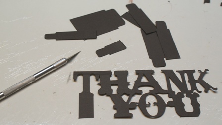
 First, I cut the scalloped card and "Thank You" pop up (pop up creative feature +shift) from Page 22.
I cut the birds from page 51 with the intention of using them on the front of the card holding a banner.

I just couldn't see how the pop up could attach to the card so that it folded closed properly. 
I had to adapt the pop up portion of the card below because I could not figure out how to attach the pop up phrase.
 I used my craft knife to removes the "legs" and adhered the phrase with pop dots.

To create the flags on the banner, I used the Birthday Bash cartridge.  There are a variety of flag shapes on pages 58-63 under the "font" creative feature.
I used a small circle punch to cut out the circles adhered to each scallop with a pop dot and the chipboard letters are by Fancy Pants.  I purposely rotated the direction of the stripes to give the card more interest.

I really like how this card turned out. Even though the pop up aspect is super complicating, I like this cartridge for its unique art work and its potential.  I will keep experimenting and once I get this cartridge figured out, I will share that information!

Friday, October 12, 2012

just a quick hello

I wrote a blog entry earlier this week but Blogger wasn't able to save it and then Modzilla closed itself to install an update.  I was so peeved because it was a long one about working with Everyday Pop up cards.  I've been rewriting it over the last couple of days but its slow going (it is kind of boring the 2nd time around).  So I am just posting a quicky to show you the card that I made with everyday pop up cards (after my original plan bombed out) and also the cake our family made for tonight's Family Fun Festival Cake Walk!
My husband says it looks like a rainbow went poop on one of our dinner plates...he's so poetic.  So that is some of the crafty I have been up to although there is more but that is for another post. Toodle-loo

Tuesday, October 9, 2012

Comprehensive Overview of Cricut Cartridge Locker Talk

I apologize for the "recess" from posting comprehensive cartridge overviews.  I purchased 6 new cricut cartridges over the last month and have been spending some time getting to know them better.  I have been particularly focused on Everyday Pop up Cards which has proven to be more challenging than most. More on this when I have completed my research.


Today I am presenting the Cricut Cartridge Locker Talk. In this blog entry you will find:
  • a sample view of the cartridge images
  • a look at all of the phrases offered on the cartridge and a PDF reference sheet download
  • a look at all of the cards offered on the cartridge and a PDF reference sheet download
  • a look at a handbook page with explanation of the creative features offered on this cartridge
  • a link to the PDF of the handbook
  • a spreadsheet with a list of the images, words and phrases, cards and projects with their pages numbers including a link to download the PDF version.
The sample sheet on the back of the cartridge box is posted above.  Locker Talk is a goldmine of artwork, especially for teachers, parents and students.  This cartridge includes 2 primary images with layers, shadows and blackouts, a phrase, a card and a book cover!  I really like cartridges with detailed primary images like what you find on Locker Talk.  The extra touch of a shadow and a blackout can make a die cut look so much more professionally constructed.  The phrases are also more elaborate than on many other cartridges with layers that offer lots of dimension.  Below I have posted a view of all of the phrases included on this cartridge:
 
You can download a PDF copy of the Locker Talk Phrase Reference Sheet by clicking the link below. If you would like to share this information on your blog, instead of copy and pasting this info, please post a link to my site.
 
This cartridge also offers a card feature which is actually just a smaller version of the book cover.  There are two cards available- 1 for each of the primary images.  The cards themselves do not have artwork, but rather provide a platform for the primary image.  Take a look below:
The primary images on this handbook page (key on the overlay) are the scissors and the glue (add shift).  The cards provide windows for the primary images to be adhered and would not be very identifiable on their own. In this case, both cards open vertically with the windows in the center, while the book covers are designed to open horizontal and the window is in the lower right corner.  The feature buttons "Layers", "Shadow" and "Blackout" are tied to the primary image.  The "Phrases/Layers" feature is designed to stand alone without needing any of the other features to support or accent it.
Below you will find images of all of the cards on the Locker Talk cartridge.  
 
You can download a PDF copy of the Locker Talk Card Reference Sheet by clicking the link below. If you would like to share this information on your blog, instead of copy and pasting this info, please post a link to my site.
You can download a PDF version of the Locker Talk Cartridge Handbook but clicking HERE.

Last but not least, here is a list of all of the images and phrases on this cartridge with their page numbers.  If you find any errors in the spreadsheet, please let me know so I can correct them. If you would like to share this information on your blog, instead of copy and pasting this info, please paste a link to my site. The spreadsheet image below as a JPEG but you can download a PDF version of the Locker Ttalk table of contents here:


Sunday, October 7, 2012

Do you organize more than you scrap?

I scrapbooked for two hours this morning and then I organized for two.  Not because I am a tidy crafter, but because my table had developed scrappy wakes of cut paper, backs of glue dots, stray embellishments, a dried paint palette, a paper piercer, tweezers and other misc. tools.  It had been a couple projects since I had done a proper cleaning but not thaaaat long, yet my work area was shrinking and I was loosing more things than normal.  I have a system of storing things and if I don't return or refile things straight away my already limited space becomes a jungle of crafting materials.

First I sorted my scraps by color then filed them in my filing system. 
After, many, many experiments, I have found that having my scraps right next to me at waist level is best.  If they are out of reach, I won't bother pulling them out and if I can't look down into them, I won't bother looking thoroughly.

Next I put my embellishments back into their respective binders.  This is a new system I put into place a few weeks ago after many, many failed approaches.  So far it has been good and the return process is easy enough that I actually do it.
After that I gathered up the ribbon laying around here and there.  There were lots of loose strands and in random places too.  You'd think I'd grabbed a handful and threw it up in the air.  I organize my loose ribbon by color in zip lock bags while the cards and spools are stored together. All of it fits nicely in a drawer next to my work table. This makes clean-up easy and I can find things pretty quickly too.
Then I put away buttons and do dads in the storage drawers.  This piece of furniture seemed like a great idea at the time I bought it, but sometimes I think it is way too big for all of the actual storage it provides.
Here is where I keep my small Prima flowers, stamps, masks, bling, buttons, brads and metal embellishments. I also keep my acrylic paints, jewelry making supplies, mixed media materials, mediums, inks, drafting tools and cricut binders in this unit.  I have to be diligent about putting the right thing in the right drawer or I may never see it again.

On top of this unit I keep my papers and card stock organized by color.  The red box on top of the paper is my "to be filed" box.  When ever I pull out multiple sheets to match a certain color or look, I put the paper I didn't use in the box so that I can file it away. I hate filing but today I did it.
I organized my paper by color a couple months ago.  I had to implement a new system because the cardstock/ paper/ double sided paper organization was NOT working.  Do I like it?  It still a chore trying to find a specific paper amongst all of the others.  I think it would be a much more functional system if the paper was at waist level so I could look down onto the top of the paper holders rather than relying on the top edge for my searches.  Someday, if I have a bigger room, I'll give it a try.
This horrendous mess is actually a hub of activity. Here resides my borders, medium flowers, sewing machine, 8.5 x 11, 8 x 8, 6 x 6 and 4 x 6 paper, chipboard letters, adhesives, cricut accessories, xyron ephemera, and many other critical tools and supplies.  The big binders on the top of the bookcase are old invitation sample binders that I grabbed before they went into the trash.  Someday I am going to adhere all of the kid's artwork to the pages.  "Someday" being the operative word. It looks really disheveled in the photo and that is because it is, even after my best efforts this morning. sigh.

This is the view of my desk and peg board area if you are standing in the room's left corner.  My drafting table is large but my Imagine and Cutterpillar do take up some real estate.  I have one of those old-school monitor arms for my laptop or to store projects I have not finished.  The peg wall has all of my prisma color markers and tools/ supplies I need to keep handy like my crop-o-dile, brayer, wire cutters and T-square. Under my table I store my big shot, sizzix dies, punches, cricut cartridges and my "My Story" machine.  You can see the tip top of my drafting chair in  between the closet door and the table.  Lately I have been using it as another work surface if my desk is overpopulated.  In desperate times, I just it into the hallway and use the floor for my overflow crafting.

It is a lot to keep track of and a small space to house it all. If I don't clean up after a project, I develop layers of mess until I can't lay anything flat on the table.  So I organize and then I organize some more.  If I didn't like to organize, scrapbooking would be out of the question.  I just have to build organizing into my scrapbooking time.  If I plan to scrapbook all afternoon (12 - 4), what that really means is 30 minutes pulling supplies, 2 hours 30 minutes scrapbooking and 1 hour cleaning up.  If I put off cleaning up then the next scrapbook cleanup will beall that more time consuming.

It doesn't bother me really.  Scrapbooking isn't just about making pretty pages with your photos.  Scrapbooking is shopping, looking for inspiration, chatting on the message boards, taking cool classes, watching you tube videos, a little more shopping and yes, organizing.  That is the deal.


Tuesday, October 2, 2012

My List of the Top 10 Conditions When Scrapbooking

 
Everybody has there own way of doing things in life.  Some people watch TV while they eat their dinner, others sit at the dining room table with place mats and cloth napkins.  Some people take a bath before going to bed while others take a shower in the morning.  Some people eat a healthy well balanced diet of fresh foods while others eat when and what they can and take vitamin supplements to keep their body in check.  The same is true for scrapbookers.  Some scrapbook on a table while others prefer the floor.  Some people listen to music while they scrap, while others like the quiet.  I was thinking about my preferences this morning and and came up with a list of my top 10 preferences when scrapbooking.
  1. Lets talk about my bed - I have a scrap room with a nice drafting table to work on but the space is too limited when I'm really getting down to business.  My California king bed is the best place to scrapbook because their is no clutter to distract me and I can spread everything out around me like a skirt of creativity. (This is NOT my bed)
  2. Dark chocolate covered blueberries are the perfect crop snack.  They don't leave my fingers sticky, they taste delicious, the sugar puts a smile on my face, the caffeine keeps me focused AND they are anti-oxidants.
  3. Real Housewives of anywhere are the perfect shows to watch (listen to) while scrapbooking.  Many people find these types of programs appalling and I get it, but for me, these drama driven, ridiculously shallow and dubious programs are a hoot.  Having  one on while I scrapbook is like getting hot fudge on my ice cream.  Yummy!
  4. I prefer scrapbooking in the day rather than the night.  Oddly, I am a night person but I much rather work with natural light and in the waking hours while the rest of the world is doing their thing.  (This is NOT my home)
  5. A comfortable climate is very important.  It shouldn't be hot nor cold.  I love a gentle breeze as long as none of my materials get blown around.  When I am hot, things stick to my fingers and when I am cold...well, I'm cold.
  6. I have a dress code for scrapbooking.  I always were comfy clothing but no loose long sleeves or pant legs.  Leggings and t-shirts are ideal because small embellishments can't get lost in the folds, my skin doesn't get sweaty and stick together and I don't worry about paint, glitter or ink ruining my frock.
  7. Hair must always be in a bun on top of my head.  Not tight so that I get a headache and not loose so that stray hairs fall in front of my face.  Just out of the way and non-intrusive. (This IS me and in proper dress code)
  8. Accessible inspiration is a must.  Every so often I do a screen shot of the newest eye candy on my pin interest account and print it out. I tape the print out on the wall so I can get a creativity mojo boost anytime I get stuck . Below is my most recent copy (aren't these pages scrumptious?):
  9. Minimal liquids.  I know we are supposed to drink lots of water, but I try to avoid bathroom breaks as much as possible.  Getting up to use the restroom means I have to move everything I have spread out on my left hand side so I can exit my bed.  Of course the accidental spill and cold beverage condensation are also concerns but more than anything, being settled in for the long haul trumps hydration in my book.
  10. And one of the most important environment accessories is multiple trash cans.  One trash can is simply not enough.  Even if it is right in front of me, I guarantee you, I will lose sight of it.  I need several strategically placed waste baskets spread around my area so I can clear my work space without delay.  Everyone has that point in their scrappin routine when their space becomes too crazy to generate creativity.  All of the sudden you are losing adhesive, scissors, embellishments; you get left over paint on a photo; and then you knock over a tin of buttons.  These conditions can drive a girl to pack it up but by having multiple trash cans handy, you can bring order to your space before you get a chance to yell "argggggghhhhhhhh!"
 So that is my list - I suppose it reveals a lot of my idiosyncrasies. We all have a way of doing things in life.